Text Styles for this blog
Note before you start - most of these effects have a hover state to show the effect more clearly.
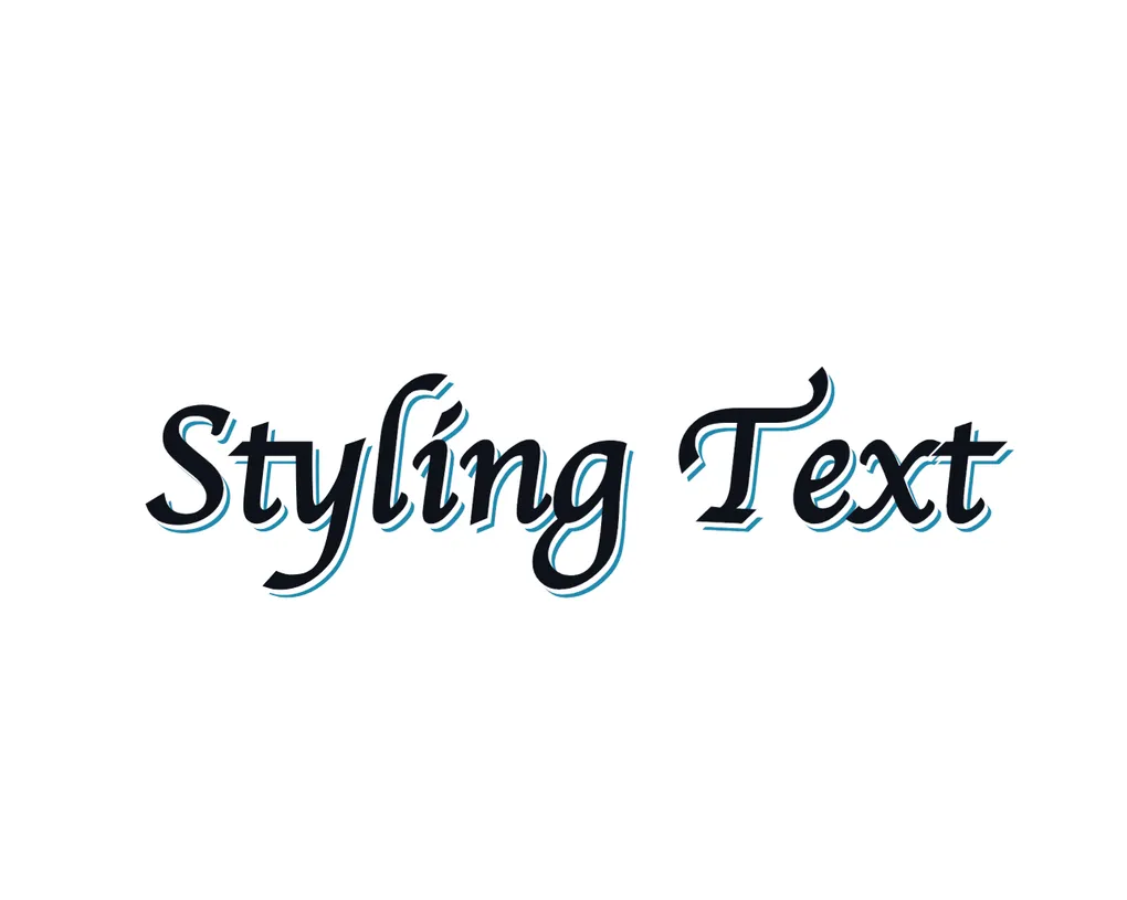
Styling Text
Recently I was reading the childrens book Never Touch a Grumpy Elf to my son and I noticed that it has some really interesting things with text styles. It seems to be in an attempt to keep a child interested in what they are reading and differentiate it from the many other books that could be chosen.
It brings some interest into what is otherwise fairly lackluster story and he loves it. I want to bring some of that into this blog and have made this playground to do it.
There are all sorts of things like underlines, capitals, gradients, shadows, and more.
The hard part is combining all these little changes into something that is both interesting and not a pain to look at (unlike that effect then…). Too much and it becomes distracting like above, too little and it is boring.
How does the book do it?
A single page of the book looks something like this.
touch a grumpy cat.
whose paw has got athorn.
But give some meat
as a tasty treat
then their worries will be gone.
I think it is probably a bit much for a simple blog. There is a lot happening here where almost every word is something different. But as something for kids it is great.
I think the big thing it is missing though is some animation. Now I know it is a book and that is not possible, but I love it when things are not static.
The one great part about the web is how dynamic it can be. The book has to grab attention at the beginning so has to put everything in at once. On the web we can make things change over time to keep interest.
How to move this to the web?
So far you have seen a bunch of examples that are pretty small and work well for a book, but this is on the web with the power of a browser so I think we can do a bit more. I am not what you would call a great animation designer or UI designer, but luckily there are thousands of examples of this sort of thing throughout the web I can take inspiration from.
One caveat to all this is that many designs require each character to be wrapped in a span or similar element to apply effects individually. This is pretty painful to do manually so I would suggest some script to do it for you.
Typewriter
Likely the most common example of this is the typewriter effect. It is used all over the place to give a bit of life to text.
I would almost say this is the most overused effect in all of the web. It does look really good though so I can understand why.
Text Images
This is an effect you will see a lot on the hero sections of websites. It is usually only one or two words that take up most of the page, and would be pretty boring without some sort of effect. It is also mostly combined with some transitions to make it visually interesting, as if there is some sort of movement happening.
Text GradientThe common example you see is the gradient text that slowly moves across the text. It works well, but it doesn’t
have to be limited to a gradient. This actually uses the background-image property so you can use any image you like.
Here are some other gradients that can be used to create patterned text.
background-image: radial-gradient(#1B8AAE 1px, transparent 1px);background-image: repeating-linear-gradient(0deg, #1B8AAE, #1B8AAE 1px, transparent 1px, transparent);background-image: repeating-linear-gradient(to right, #1B8AAE, #1B8AAE 1px, transparent 1px, transparent);You can also use an actual image.
background-image: url('/flow.png');Shadows
Text shadows are something I didn’t realise were so pervasive in web design until I learned more about it. A lot of interesting text effects I assumed were more complex are actually just a few lines of CSS with multiple layers of shadows.
They aren’t just one effect either - there is so much that you can do with them to give different effects.
Old school signage
Back in the day when hand painted signs were more common, painters would often use multiple layers of shadow to give the text more depth and make it stand out from a distance. This is a simple traditional style that is two text shadows, a white one to prevent overlap of conflicting colours, and then a darker one to give it depth.
Painted SignsCutouts
A similar effect, but the shadow keeps going for a long time.
This is a CutoutDepth
Another similar effect giving some depth to a digital style.
Layered ShadowsAngles / Rotation
Sometime having text on its own angle
can give a nice effect without any
other styling required.
This is probably best for smaller pieces of text rather than full sentences.
Reflections
Similar again. This is some duplicate text rotated and skewed to give a reflection effect.
Reflected Text
More and more…
There are so many more effects that can be done. Things like custom SVGs making things look hand drawn, using these effects with different fonts, changing outlines and so much more.
I recommend you look search for more custom text effects to find something you like, then use it!
Thanks To
This was inspired by reading a book, but I also used a bunch of resources that helped me put this together once I started. You should check them out for even more ideas.
- Magic Patterns - Used for some text backgrounds
- Prismic - Some text effects
- Font-Tester - Some text effects
Want to read more? Check out more posts below!